

ATOMICON 2026
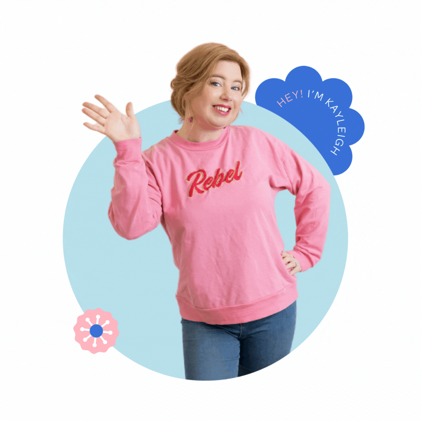
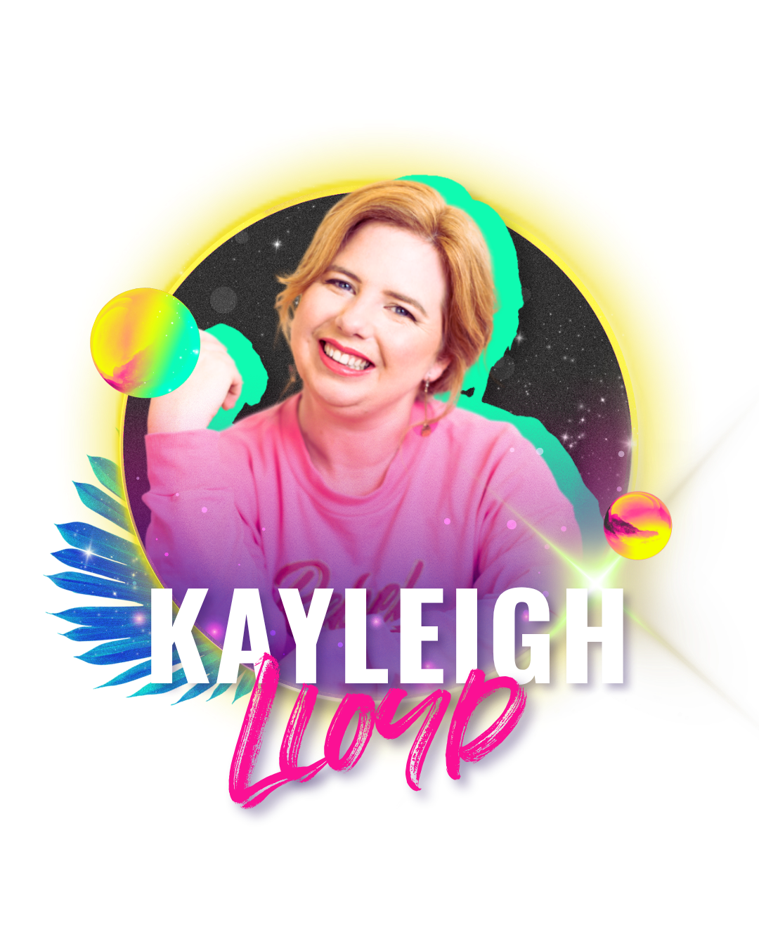
HI! I’m kayleigh
The designer and creative director behind this years ATOMICON branding. If you’re part of the experience right now I hope you’re having the best time, I've poured my heart into making this event look as good as it feels.
If we’ve not met, I’m the creator of bold, unmistakable brands for ambitious founders and high energy events. If you need to stand out from the crowd - let’s have a chat!

ATOMICON 2026
DREAM PROJECT
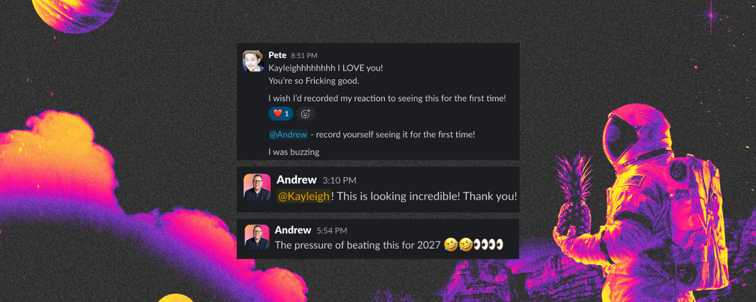
I'll be honest … when Andrew and Pete got in touch and asked me to be the brand designer behind Atomicon 2026 I may have done a little happy dance in my kitchen.
I’ve attended ATOMICON for the last three years. I know what it feels like to walk into that room, the energy, the excitement, the slightly overwhelming feeling that you're exactly where you're supposed to be. It's unlike any other event I've been to.
So when they asked me to be the creative brain behind this year's brand, I didn't just want to make it look good. I wanted everyone who picked up a brochure, put on a lanyard or walked into that room to feel it before they'd read a single word.
That's what great event branding does. And that's why this was SO much fun to create.
ATOMICON 2026
HOW I WORK
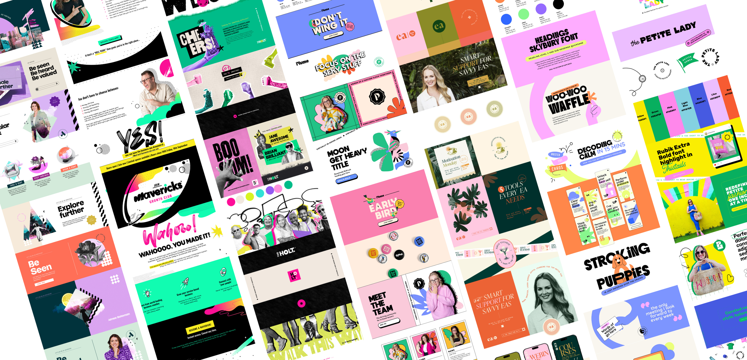
I specialise in building bold, personality-led brands for ambitious founders and high energy events. The kind of brands that make people stop, look and never forget you.
Over the last six years I've worked with some of the most recognisable names in the UK founder and freelance space — helping them show up with more intention, more personality and more of themselves.
Here are a few you might know…


LEA TURNER - THE HOLT
Lea came to me needing a brand that reflected the community she was building — bold, warm, completely distinctive. The HoLT needed to feel like the community it had become. We built a brand that's as recognisable as Lea herself.

LAURA BRUNTON - IGNITED WOMEN
Laura was building one of the most exciting female founder events in the UK and needed a brand to match the energy in the room. We evolved the event identity to match it’s growth and made women feel seen before they'd read a single word.
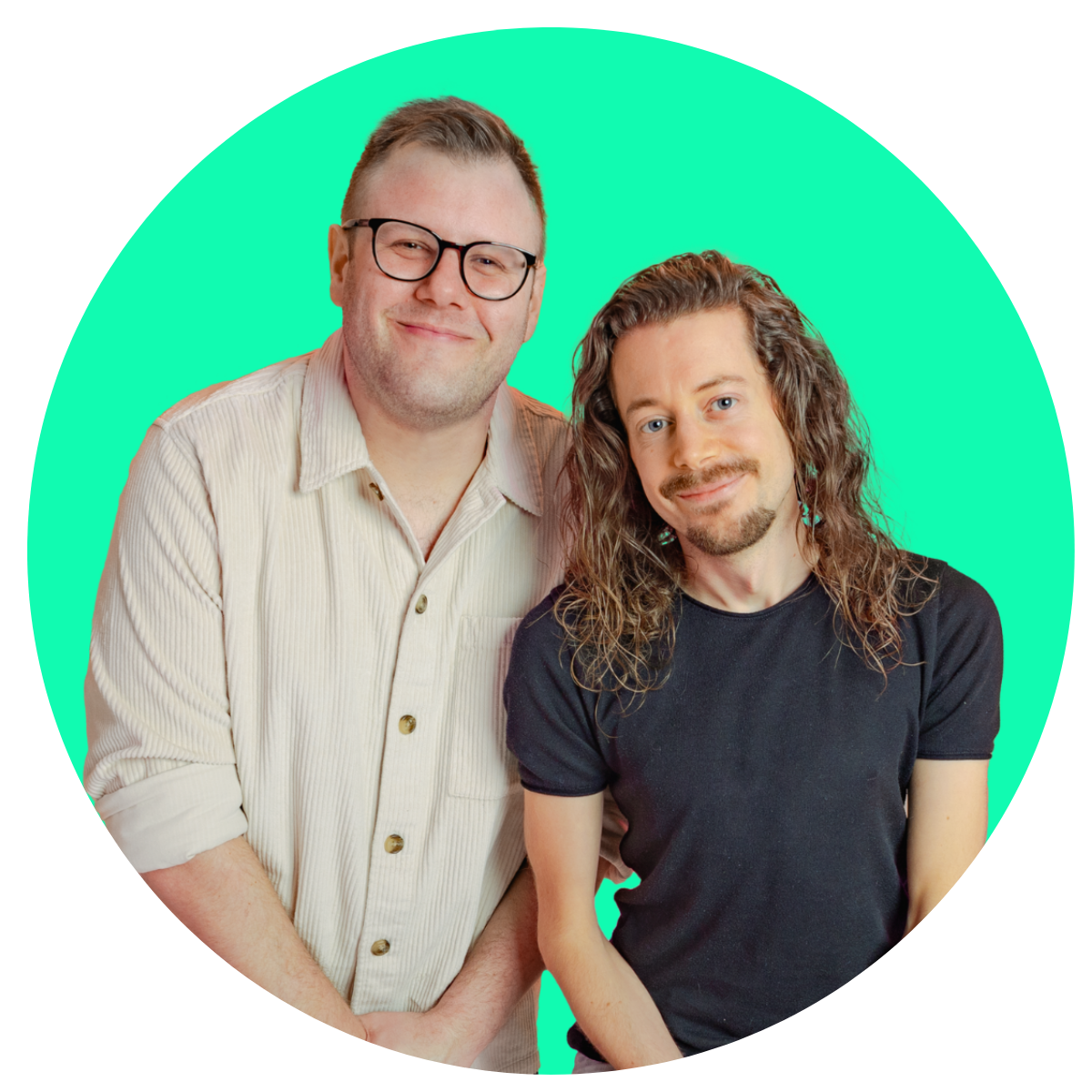
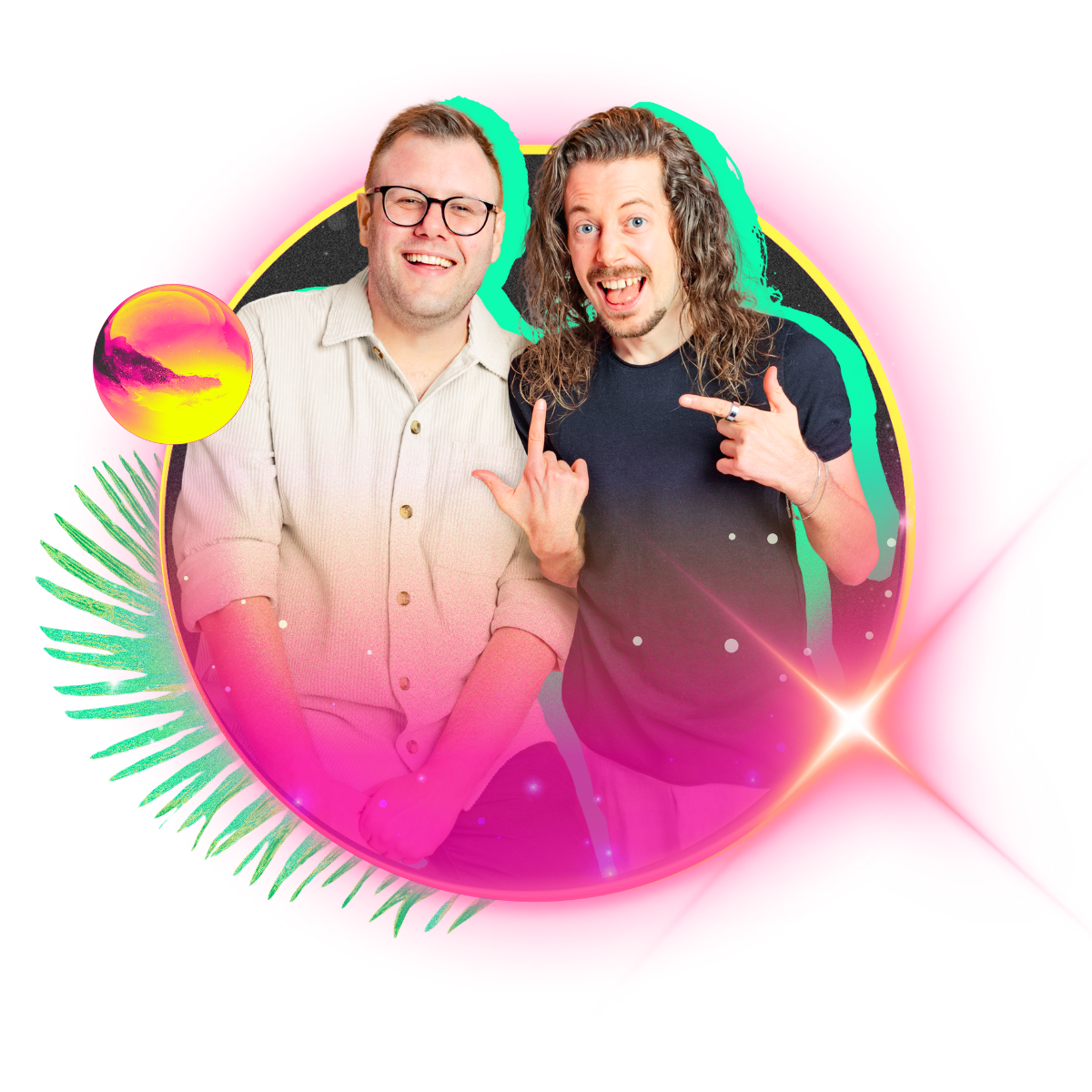
ANDREW & PETE - MAVERICKS
If you’ve seen the ATOMICON brand then you’ve probably seen the community behind it too. Andrew and Pete wanted to rebrand Mavericks to feel bold, energetic and completely on point for their audience. We built something that captures their personality and their mission in equal measure.
ATOMICON 2026
WORK WITH ME
Whether you need an event brand, a personal brand or a complete brand build — here's how we work together.
Branding packages from £2,950(+VAT)